Displaying retail data & insights across thousands of locations
Company
Compass Digital
My role
Product Designer (Lead)
Project duration
8 Months
My contribution
Data visualization
User interviews
User flows
Prototyping
High-fidelity designs
Testing and QA
Low adoption and usability of internal data dashboards
The product had been struggling with low adoption, misunderstood use cases and poor user experience.
Confusing versions of similar products lead to lack of adoption.
Why improve these dashboards?
Poor usability was causing busy site managers to give up.
My job was to ensure the dashboard met the needs of our users by surfacing needed data in a easy to digest way.

Users faced choice fatigue with many similar dashboards
We established clear initial goals:
Simplify complexity
Site-staff, division managers and operators don't know where to go for which data. With two dashboards that have similar functionality, staff faced choice fatigue and pick neither.
Site-staff, division managers and operators don't know where to go for which data. With two dashboards that have similar functionality, staff faced choice fatigue and pick neither.
Bite-sized insights
Our site-staff and execs are busy and not always analytic minded. We need bite-sized insights to save them time and energy.
Our site-staff and execs are busy and not always analytic minded. We need bite-sized insights to save them time and energy.
Access to deep-dive analytics
Our systems were tracking everything, from transactions, locations, food type etc. Our site staff needs visibility into these numbers to inform their decisions.
Our systems were tracking everything, from transactions, locations, food type etc. Our site staff needs visibility into these numbers to inform their decisions.

How do site staff and managers use these dashboards?
I gathered information through interviews, documentation research and speaking with subject matter experts, about the use cases of execs, site managers & implementation managers.
User story #1: Time Constraints
I don't have much time in the day to be looking deep into the data. I need to see well-framed insights, so that I can make incremental improvements over time.
Ex: Adding a promo code last month increased revenue on burgers by 18%
I don't have much time in the day to be looking deep into the data. I need to see well-framed insights, so that I can make incremental improvements over time.
Ex: Adding a promo code last month increased revenue on burgers by 18%
User story #2: Promo Codes
I need to monitor our promo codes and understand if they are bringing in more or less revenue, which products they're popular on and un-discovered opportunities, so that I can modify accordingly by rotating out unpopular or unprofitable promo codes.
Ex. I want to ensure promo code usage remains under 10% of all transactions
User story #3: Layers of Visibility
As a district manager, I need visibility into a variety of locations all at once, so that I can monitor performance and make adjustments as needed.
Ex. I need to check in on the performance of all Ryerson Campus Facilities to make adjustments or report findings to the appropriate parties
As a district manager, I need visibility into a variety of locations all at once, so that I can monitor performance and make adjustments as needed.
Ex. I need to check in on the performance of all Ryerson Campus Facilities to make adjustments or report findings to the appropriate parties
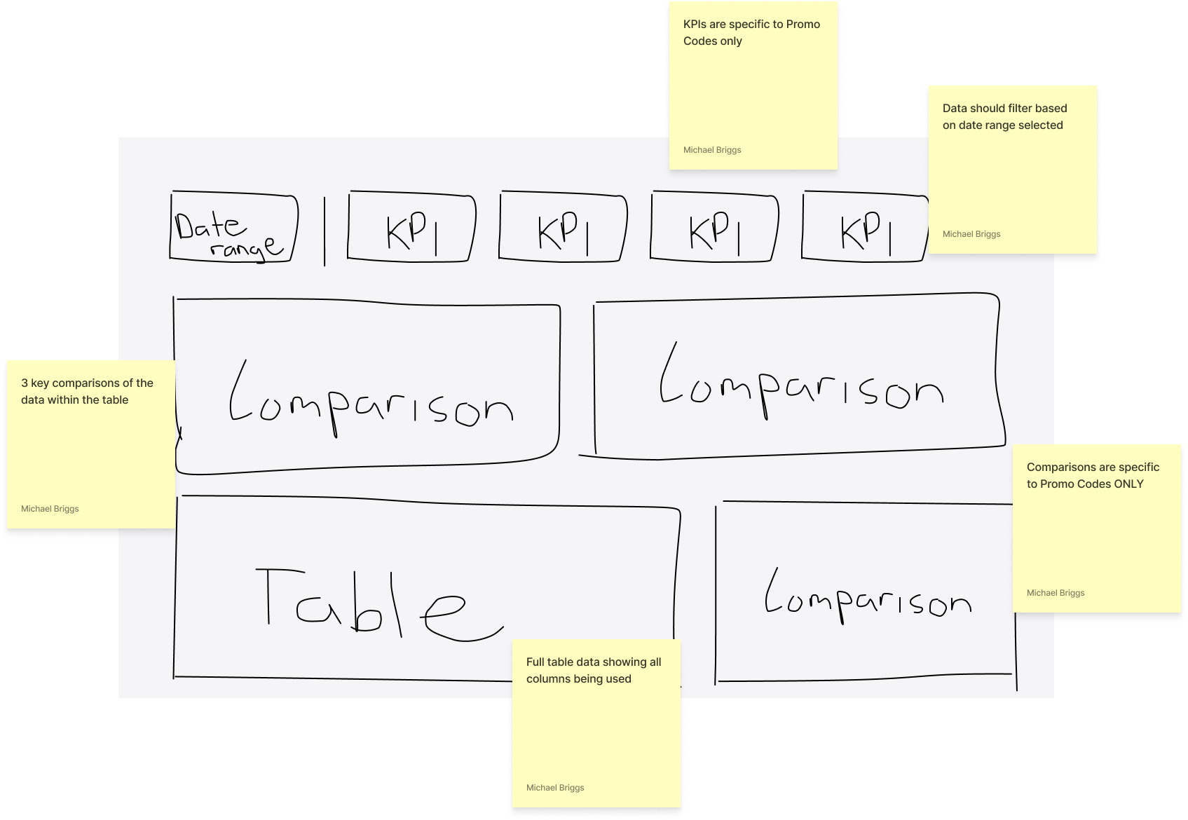
Screenshot from a FigJam
Designing the solution
Leveraging the insights from user research, I collaborated closely with the data scientist, subject matter experts and other managers to design/build the interface, with support from the data scientist to model the data and bring the drill-down functionality to life.
Working within the constraints of PowerBI, I designed a balanced solution between functionality and visual polish limitations.
Working within the constraints of PowerBI, I designed a balanced solution between functionality and visual polish limitations.
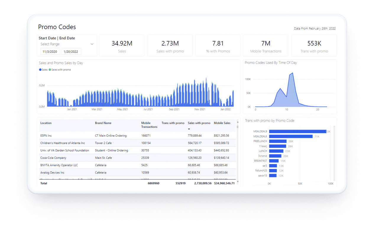
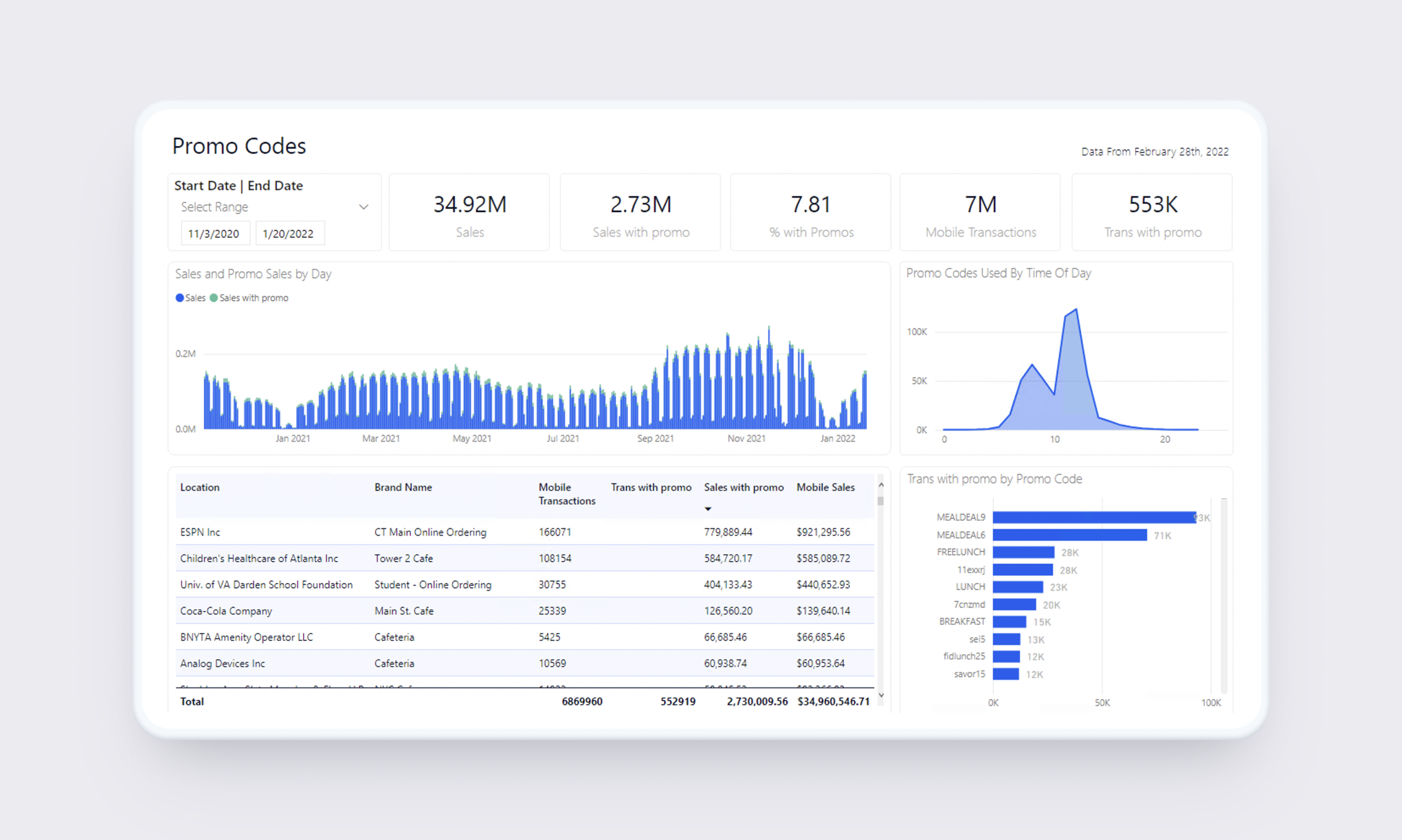
Promo Codes
Users can understand sales with promo codes used vs without, see promo codes used by time of day, most commonly used promo codes or dive into more detail within the table.
Promo codes page
Mobile VS Point of Sale
Understand sales using the mobile app vs directly at point of sale, mobile usage KPIs, view the comparison over time as well as dive into the full table details.

Mobile vs POS page
Bite-sized Insights Summary
KPIs, insights and high-level for execs and district managers. Understand which key drivers of change are improving or declining.
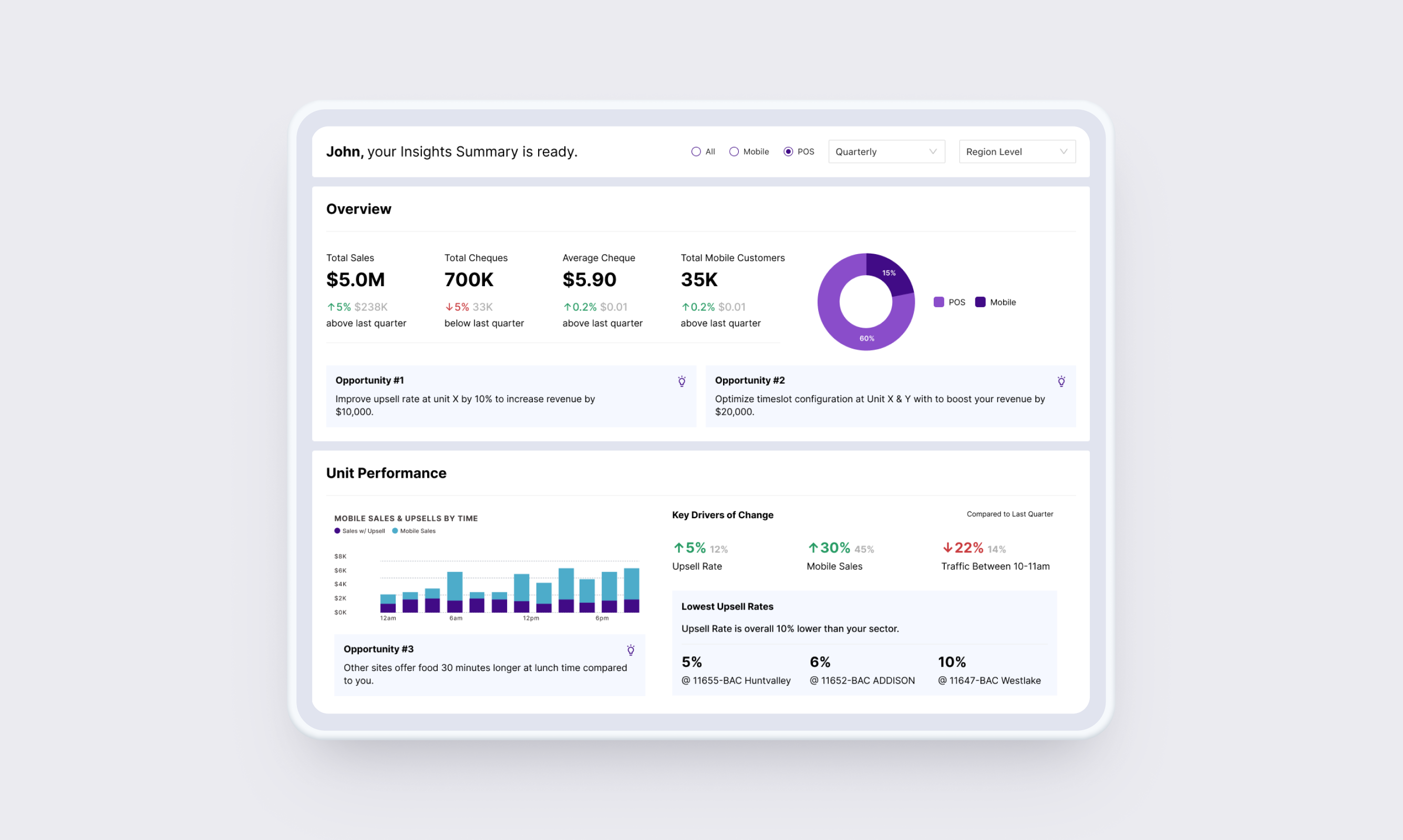
Insights Summary
"Mike, I feel like my eyes are being massaged"
"I didn't know we could have insights like this"
"This is much easier to digest than before"
The feedback was overwhelmingly positive
After launching the feature, real-world impact happened from day 1.
In-N-out
With clear charts, KPIs and comparisons managers can come in to find the data they need and leave, leaning on the Insights Summary when needed.
With clear charts, KPIs and comparisons managers can come in to find the data they need and leave, leaning on the Insights Summary when needed.
Deep-dive analytics
Complex functionality remained accessible for the analytic minded users with ability to sort, filter and view each chart based on every data point. Need to see a specific region + product type + used promo code + during morning hours? No problem.
Complex functionality remained accessible for the analytic minded users with ability to sort, filter and view each chart based on every data point. Need to see a specific region + product type + used promo code + during morning hours? No problem.
Busy managers understood at a glance
Summarized insights provided quick wins and action steps allowing them to test and improve their offers, processes and more.
Summarized insights provided quick wins and action steps allowing them to test and improve their offers, processes and more.
5,000+
Locations
200K+
Data points
52
NPS
140%
Increased usage
What I would have done differently
Looking back on some of the choices and process we took, I would change a few things.
Accessible colors
Some of the color choices I made, I would not choose today.
Some of the color choices I made, I would not choose today.
Phased approach
If the dashboard had significant usage, I would have incrementally made changes to the charts, data and pages within the dashboard to ensure a smooth transisition. However, since there was already low adoption, we didn't feel this was important
If the dashboard had significant usage, I would have incrementally made changes to the charts, data and pages within the dashboard to ensure a smooth transisition. However, since there was already low adoption, we didn't feel this was important